Logos are the best way to represent your company in a single small image. A clean and eye-catching logo might even increase the popularity of your company.
But not all logos are just a mean for representing your company, some logos also have a meaning or a motive hidden in them, which are not recognizable on the first look. Here are the top 10 logos with hidden meaning.
The FedEx logo, though quite simple has a powerful meaning hidden it. If you look closely at the red Ex in the logo, you’ll realize that the white space between E and x is an arrow pointing towards the right. This right or forward arrow highlights the importance of moving forwards towards the feature.
One would be forgiven for thinking that the McDonald’s logo is nothing but a large yellow representation of the first letter in the company’s name. And it technically is, but there’s more to it. To some, the rounded “M” subconsciously represents our mother’s breasts. In the 1960s, McDonald’s was retooling its image, which included discussing a possible new logo. Louis Cheskin, a psychologist and design consultant hired by McDonald’s urged them to keep the current logo, claiming that the golden arches had a Freudian effect that made customers imagine a pair of nourishing breasts, which then made them hungry. Some find this hard to believe, but one thing’s for sure—you won’t look at the big “M” the same way again aftertoday.
The Museum of London logo may look like a modern logo design but it actually represents the geographic area of london as it as grew over time.
Ever wondered what the three stripes on the Adidas Logo mean? They represent a mountain, pointing out towards the challenges than are seen ahead and goals that can be achieved.
In the 1800s, as a result of the merger of the two companies formed a shipping company Mitsubishi. Logo of the new company was established on the basis of previous ones - three sheets of oak and three diamonds. And translates Mitsubishi as "three diamonds". The red color of the logo symbolizes the confidence of the company as their products.
The Google logo appears to be made of fairly humble, simple colors with no flashy font or symbols, but even simple colors can have a deep relation to company image. During the creation of the Google logo, designers wanted a way to display a sense of playfulness without bulky objects or symbols in the logo limiting what they could do. This was initially achieved by skewing some of the letters, but this idea was scrapped and instead focus was directed toward color. The current logo features a pattern of primary colors being broken with a single letter shown in the secondary color of green. The broken pattern represents playfulness and the idea that Google isn’t a company that plays by the rules.
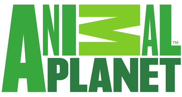
The Animal Planet logo used to be an elephant reaching out to a miniature Earth. An animal and a planet—that’s simple enough. The channel relaunched in 2008 with the intention of appealing to a wider audience and the elephant-globe logo was replaced. With its relaunch, Animal Planet sought to rid itself of the slow and boring pace associated with documentaries for more primal and exciting programming, and they attempted to present a new logo to match. The new logo is said to represent instinct, with the shades of green bringing to mind images of a jungle and feelings of primal urges, emotion, and “animalistic boldness”. That’s a lot of feeling to be had from what is essentially the name of the channel with one letter turned sideways.
The NBC logo has a hidden peacock above the above text which is looking to the right, this represents the companies motto to look forward and not back, and also that they are proud of the programs they broadcast.
The Amazon logo is an extremely simple logo and while the arrow may just look like a smile it actually points from a to z. This represents that Amazon sell everything from a to z and the smile on the customers face when they bought a product.
The Pepsi logo is a simple circle. The top half is red, the bottom half is blue, and a wavy white line runs through the center. The colors intentionally represent the American flag, but that’s just scratching the surface of this simple globe. Pepsi spent hundreds of millions on their current logo, which is very similar to their previous ones, but tweaked in a way that it (apparently) means a lot more.When submitting the new logo, the branding agency hired by Pepsi presented a 27-page document explaining the many, many connotations their design represented. According to this document the new logo represents the Earth’s magnetic field, feng shui, Pythagoras, geodynamics, the theory of relativity, and plenty more. Makes you wonder if the logo is working as intended or if the branding company lied their way into a big fat check.


0 comments :
Post a Comment